Saturday, 25 February 2012

Props


It was important to select the right kind of ouija board prop as it is integral to our story and the pivotal moment of the trailer is a shot of the board. This is the ouija board prop that we used in our teaser trailer and from which we used elements for the webpage. We found this on Ebay.co.uk. We selected this ouija board in particular because it looks old fashioned due to the font and golden brass colouring. We also really like the multiple symbols and images all over it, as they make it very clearly a supernatural and spiritual thing. They could also be linked to witchcraft, which will make the girls seem more corrupt. The board is also large enough to seem realistic but not so large that it became impractical to work with. The planchette that came with the board is metallic and pointed, which we like as it does not look very cheap so is believably an old artefact or real object of black magic.


Other props included were not as important as the ouija board, and most of the trailer did not focus on secondary props and instead followed what was happening to the girls themselves. We did this so that the trailer seemed more shocking and harsh while the girls suffered as opposed to seeing shots of objects. However some props were necessary, such as red lipstick and cigarettes in the first section of the trailer in order to emphasise the girls' corruption. We purposefully used a brand of lipstick that is like a pen instead of conventional lipstick in order to show the girls as materialistic and wealthy, as 'lip pens' such as this product are quite recent and advertised as fashionable. A vodka bottle is used in particular in the shot of a girl drinking from the bottle in order to show their lack of moderation and by extension the irresponsible nature of the girls.The lack of intelligent behaviour from the girls also makes it believable that they may be unable to protect themselves later, which could create fear or anticipation from the audience. Other than the vodka bottle, there are also many other alcoholic bottles and cans in the party scenes, again showing their irresponsibility.
Once disequilibrium has occurred, the prop of a knife is used. This physical weapon contrasts with the previously passive props and shows the shift in power in the film as the girls become victims. It also represents the more masculine characteristics of the girl holding the knife, and suggests that she may be able to protect herself and defeat the spirit. We have done this in accordance with the Final Girl theory, showing her to be more resourceful and courageous than the other girls who are only seen becoming victims. The other prop seen in the later shots of the trailer is red lipstick being used to write on a mirror. This is used to directly contrast with the lip pen used earlier, but instead of being used to make oneself appear more attractive, it is being used to repeatedly write "pay". This again represents the complete disequilibrium that has fallen, as the girls' materialistic lives have been taken over by the spirit and the power has shifted so that they now have no control. More traditional lipstick is used in the shot instead of the lip pen to reflect the old fashioned and gothic nature of the spirit and portray how unimportant the girls' materialism is.


-Emily

Using Wix

When we first started using Wix.com, we found it quite confusing due to the multiple pages and options. For example, selecting a page to start editing was in itself quite daunting as the selection was so vast. However, through experimentation and trial and error, it soon became much easier to work with it. The continued use and development of ideas in this medium gave us a better understanding of layout, as well as the possible effects that could support our genre, such as 'Glow'. As it became easier to work with, we were able to create products quicker and to a more pleasing quality. We also learnt how to incorporate many different formats of information such as text, images and videos.
We enjoyed creating a product that was so interactive, since the other auxiliary tasks that we create can only be looked at as opposed to actually involving the viewer and letting them take control.


-Emily

Final Webpage


The entry page of the website has remained the same as we liked the simplicity of it.


We have kept the black background in order to relate to the black background of the poster, showing the threat and mystery of the events in the film. The title text of the page has remained at the top in the centre, clearly standing out against the rest of the information on the page. The share options are also in the same place. Effects have been added so that when they are hovered over with the mouse they slightly expand and glow red, in the same way as the links that run down the left hand side of the page. These links are in a straight line down the side as they are now clearly organised and the page is much more easily navigated. We made the decision to add more links so that more of the page could be explored, and removed the option to see a plot synopsis as the issue was raised that a synopsis should not be available before the film has been released. The font is quite large in order to draw attention and clearly mark the different options. We have placed the option to pre-order the DVD at the top of the list, making it slightly larger than the other hyperlinks and underlining the text so that it is set apart from them. This is to encourage people to pre-order the DVD of the film in order to maximise revenue from it.


The layout has changed in that the teaser trailer has been moved into the centre of the page, with the tagline of the film and the release date underneath it. This makes the viewer more likely to watch the trailer as it is the centre of attention on the page, instead of being put to the side in the other layout. This acts to broaden our audience by encouraging more people to watch the trailer and hopefully become interested by what they see. The tagline underneath emphasises what the trailer shows, while the release date reminds the viewer of the possibility of seeing the film. We have moved the symbol from the side into the lower centre, behind the text. This looks much more aesthetically pleasing as it is is straight and frames the text. We decided that we would keep the symbol instead of removing it because we liked the involvement of secondary images on the page and thought that this relates well to the supernatural and ideas of the occult. We moved the main image of the girl to the side. The image is still quite large so that it remains clear that it is important, but we think that it works better framing the other information instead of vice versa. Although we liked the threatening positioning in the centre of the page, we think that this placement makes her appear somewhat predatory, so it remains equally effective. This layout also follows the idea of the rule of thirds, as we have separated the page into vertical thirds which aids its clarity and appeal.


We made the decision not to include a soundtrack of music on the page, as we wanted it to remain silent except for the teaser trailer when played. This is to keep the focus of the viewer on the trailer, and maintain an eerie silence when it is not playing. We hope that this will emphasise the effectiveness of the trailer in order to make it seem more interesting. We are very pleased with our new layout, and prefer it to the original one.


-Post and final webpage by Emily


Also see... Webpage Feedback and Webpage Development

Webpage Feedback

We posted the webpage on Facebook in order to get feedback, but issues were raised by a few people that they felt the layout was too scattered and confusing. We decided to keep the colour scheme and general elements but re-order the main page in order to make it easier to understand and navigate. We had liked the slightly scattered nature of the hyperlinks and images in order to reflect the havoc of the film, but in order to follow our audience's suggestions we made it simpler.


-Emily


Also see... Final Webpage and Webpage Development

Webpage Development


This is the first page of our webpage. We used the font 'OptimusPrincePS', because it looks similar to the font used on our poster and teaser trailer. The font is simple but looks somewhat gothic with slight serifs that makes the text appear more old fashioned. The font is white with red shadowing across it, connoting smudges of blood. Both pieces of text have effects to make them slightly glow red, again suggesting the supernatural nature of the film. The Enter Site link also has an effect so that it slightly expands when hovered over with a mouse, making the site more interactive and inviting. When clicked, the Enter Site button takes the viewer to the next main webpage.


This is the developed main webpage. We used the same font for all text. The title is the largest text, and it is white with an effect that makes it glow red with a slight reflection underneath it. The rest of the text on the page is white, so that the title stands out. The symbol in the bottom left of the page has been edited to make it slightly blurred and grey, and we are pleased with the way this looks against the background and coupled with the white text. The slight blurring of the symbol also links with the blurred effect on the face and ties into the mysterious element of the film.


-Post and first draft webpage by Emily


Also see... Webpage Feedback and Final Webpage

Initial Webpage Design Development

This is the initial plan for our webpage, as posted earlier.


We decided to develop the plan further, creating new webpage images.


This is the entry page we decided to include, as we found in our webpage deconstructions that it was common for some form of loading screen or entry page to introduce the webpage. We do not want it to be too complex, so will have a black background with red and white text in the centre. This follows the colour scheme of many of the films we have examined, as red is often a key on the page. The Enter Site link will be slightly animated with a flash to draw attention to it and show the supernatural element to the film we are advertising. By introducing this Enter Site hyperlink on the first page we will no longer need it on the main page as we had originally intended. There will also be options in the corner to share the webpage on various social networking sites, linking to the strong online presence of our target audience and gaining free advertising as the webpage is shown on other websites. This would broaden our audience.


This is the main page plan. It has the same black background and includes the same ability to share the webpage in the same position at the bottom of the page. Other webpages include a main image, often using the same or similar image on the film poster. The image is also often the main character or being of the film, so we are going to use the edited image of a girl being possessed by the antagonistic being with ouija board lettering covering her face. This is the same image we have used for the poster. We have decided to place the image in the centre of the page so that it is the main focus, and the girl appears more threatening. The layout is quite similar to the initial plan, with the hyperlinks and trailer surrounding the main image. We have decided that the three hyperlinks in the bottom left hand corner will be laid out on each point of the symbol that is in the centre of the ouija board prop we used. This is to tie into the gothic supernatural genre and make the layout more themed.


-Post and webpage design by Emily

Teaser Trailer First Draft

The first draft of our teaser trailer has been posted to Youtube, so that we can get feedback from our audience in order to make any changes necessary.


Wednesday, 22 February 2012

Narrative Structure theory

Narrative structures


  • Tvzetan Todorov – Suggests narrative is simply equilibrium, disequilibrium and then a new form of equilibrium
  • Vladmir Propp – Characters and actions (21 functions of character types)
  • Claude Levi-Strauss – Constant creation of conflict/opposition propels narrative. Narrative can only end on a resolution of conflict. Opposition can be visual (light/darkness) (movement/stillness) or conceptual (love/hate) (control/panic) and to do with sound track.


You must separate plot and story


  • Plot = The strict chronological order in which events occur
  • Story = The order in which each of the main characters finds out about these events.


Identifying the narrator who is telling the story is a vital question to be asked when analysing any media text. Stories may be related in the first or third person, POVs may change but the narrator will always stay the same.
-Reveal the events which make up the story
-Mediate those events for the audience
-Evaluate those events for the audience
The narrator also tends to position the audience into a particular relationship with the characters on the screen.


Comprehending time – Devices
* Typing the time/date info on each new scene
* Flashbacks
* Dream sequences
* Repetition
* Different characters’ POV
* Flash forwards
* Real time interludes
* Pre figuring of events that have not yet taken place.


Locating the narrative
Each story has a location. There are sets of conventions to do with that location, often associated with genre and form.
Narrative structure can be divided into 3 sections which is referred to as a three act structure: setup, conflict and resolution (fits in with Todorov)


  • Act One = Setup – where all the characters and their basic situation are introduced and exploring character background.
  • Act Two = Conflict – Bulk of the story and the inciting incident with character development.
  • Act Three = Characters have to confront the problem – leads to the end.


Linear and non-linear narrative structures
A non-linear narrative is one that does not proceed in a straight line, step by step fashion, such as where an author creates a story’s ending before the middle is finished. Linear is the opposite, when narrative runs smoothly in a straight line, and is not broken up.

Tuesday, 21 February 2012

Final Choice in Poster


We are pleased with the effects we created on this version and decided that it would be our final poster.


-Emily

Poster Further Editing and Feedback

We edited the initial edited image further in order to experiment with the appearance of the poster, using the same editing software or Adobe Photoshop and Picnik.com. We then used social networking site Facebook to gain feedback from other people of our target audience so that we could see which posters would be most effective.


This is the first possible poster that we created, using the initial edit of the selected image. It was popular with our audience, with many people saying that the make up looks very effective and scary. Some issues raised with it were the fact that it is perhaps too clear, such as the plain neck and shoulders.


This has been edited further using Picnik.com to create a dark and slightly blurred effect. We thought that it looked quite effective in terms of the black and slightly green colouring, as this is often linked with the supernatural, and also made it more mysterious by hiding even more about the girl and surroundings than the previous poster. This poster was also popular with our target audience, and it was reported that the colour scheme added to the scary effect. However,it was commonly reported that they would prefer it if it were slightly brighter and less blurry, so that the image of the girl and the text was easier to see to create more intense fear.


Combining the two feedbacks of the previous posters, we decided to use the same effect of 'Ghostify' on Picnik.com to create a monochromatic and slightly blurred effect on the image and text, but we lessened the blurriness and increased the contrast so that the image was much sharper. The blurred effect was enough to make the face seem somewhat distorted, adding to the unnatural theme of the image and relating to the corruption of humanity that occurs when the spirit takes over. We were happy with this effect as it made the face really stand out from the black background, with her decayed flesh and unnatural eyes becoming the most prominent feature of the image so that the supernatural theme is very clear. The black and white face also referred back to our interest in the 'The Number 23' poster in which monochromes were used. We experimented with the font, using the same font that we used for our teaser trailer of 'Sell Your Soul', as it is decorative and gothic in shape. We used a mottled red and pale yellow for the text in order to make it stand out against the background, and also to connote the ideas of blood and violence that are often represented in horror film posters. We have tried adhere to to the conventions of posters through this, and felt that the product looked very effective through the soft colouring. As the only colour on the poster, the red stands out and shows the connoted violence and threat to be a major part of the film. The slightly smudged effect of the text could suggest smudged blood, or an unnatural tone to the text as it is not conventional in appearance. The layout places the three pieces of information about the film of the tagline, the title and the production information in one third each of the right hand side of the image, following the rule of thirds to make the poster well balanced.


We experimented with a textured and coloured background instead of a plain black one, to see whether this aided the effect of the poster. We used Picnik.com to add the texture, fading it so that it was slightly visible but not the main focus of the image. The fading of the face against the textured background was effective, and the red colour being used across the background made it obviously a strong theme throughout the narrative. It also makes it appear more supernatural due to the aged and smudged look that is unconventional in normal film posters. In order to make the text stand out against the poster background, the title is very pale so that it appears white. The poster used the same layout as the previous poster in terms of positioning of the girl and the text. There was some concern that the added background detracted somewhat from the impact of the girl and the make up, and so lessened the blunt aim of the poster that was better achieved with a black background. 


-Emily (post)
-First poster edit by Meg
-Further poster edit trials by Emily

Poster Initial Editing of Selected Image


This is the initial editing of the selected image. We have mainly used the editing software of Adobe Photoshop. The image has been editing in a similar way to the test edit in terms of making the eyes appear unnaturally coloured and textured. More edits have been included by making the hair appear greasy and heightening the contrast so that the colours and flaky quality of the skin are harsher. This makes the face appear very decayed and unnatural, casting a very clear idea of the supernatural. It could be said to be similar to some zombie images, but this still links to the decayed impression that we want to create. The editing around the eyes has also heightened the shadows around them created by the make up and pose, making the girl appear very ominous and abnormal. We are pleased with this initial edit and will use similar techniques to create texture wording next to the image for the poster. This image could be improved through editing by making the shoulders more shadowed so that it is not as obvious that they are still normal in colour, as it looks somewhat strange currently.


-Emily (post)
-Meg (photograph and edits)

Poster Photo Shoot

We organised a photo shoot with the real girl that would be appearing in the poster as opposed to a test subject and repeated the make up on her face. We tried out different poses with this girl to see if she looked more effective in a different pose to the test subject, although they were all quite similar. Meg took the actual pictures as her expertise from Art and Design meant she was the most capable, as well as creating the makeup itself. Emily and Rhiannon gave character motivation to the model and suggested appropriate poses and expressions.


In this image the girl is leaning forward as in the test images, as we thought that this looked predatory and interesting. This again creates the idea of coming out of the darkness, which is a theme we are keen to include in the finished poster. However, the face needs to be more down-turned in order to create darker shadows across the face, as in this image her face is quite light, making her appear less threatening.


In this image the girl is leaning away from the camera and pulling a slightly snarling face in order to try and express a more animalistic quality. However, this does not work very well as it makes her shoulders too visible and does not make her look very threatening. Although the face is unusual, it does not have the same intensity as a closed mouth stare so is not as effective. As the girl is leaning away from instead of into the camera, it does not create the same feeling of invasion, which was part of the discomfort we were trying to create in the poster.


This is the most successful pose that we found, as the girl is leaning towards the camera and therefore inciting the predatory nature we wanted. She has also tipped her head forward in order to cast some shadows across the face, especially around the eyes. This makes her appear much more ominous, and her stare appears more intense. Her head is tilted very slightly to the side, making her seem slightly animalistic in her movements, and therefore showing her humanity to have been somewhat lost. We will use a pose similar to this one for our poster.


-Emily (post)
-Meg (photographs)

Poster Test Shots Edited


This is the selected shot with test edits and the initial layout plan. We have used photo editing software Adobe Photoshop and Picnik.com in order to create the effects of the strange eyes. The texture of the skin was also used behind the wording in order to produce a continued theme of colour and decay while also standing out due to the light colour. The face is close to the camera as it leans forward, making it appear more threatening to the audience, and this is emphasised through its stare straight out of the poster. According to the rule of thirds, the main features of the girl and the title and date of release are in the middle of the image. The tagline and other information is below in the bottom right hand corner. The background is black so that nothing except the title and face are shown, revealing very little about the narrative and portraying the darkness of the threat as it comes forward.
We were pleased with this test poster as it appeared effective in the positioning and make up of the girl. The placement of the title also looks good next to the face, showing it to be significant equally with the face of the girl. We liked the basic nature of the poster as it was not too cluttered with information that could lessen the impact of the image or the title of the film. The tagline plays into the title as it refers to the idea of paying for sins while undergoing penance, showing a definite religious or spiritual theme to the film. The repetitive nature of the date also looks appealing. The poster could be improved through the use of more editing on the face to make it appear even more unnatural, and perhaps by incorporating a different font that appears more striking and gothic.


-Emily (post)
-Meg (photograph and editing)

Poster Test Shots

We tried out different make up on the face to find the kind of effect we wanted of decaying skin. We wanted to create shadow on the face to make the face appear more gaunt and also more threatening. Meg used her skills learnt in Art and Design to aid the group in exploring different techniques in order to find the more successful one.


This attempt used porridge oats, fake tan, black paint, flour and water, with a layer of face paint over the top in order to accentuate the black circles of the eyes and the lips. However we found that the mixture did not create the desired effect of flaking skin and instead went brown and sticky. It was also incredibly difficult to paint on without the paint being obvious. Emily's similar colouring to our main character meant that she was selected for the initial experiment of the makeup, while Meg tried different techniques.


This attempt used just porridge oats, flour and water as we thought that the last mixture may have combined too many ingredients. This mixture was also too runny, making it difficult to paint on without the paint running down the face and creating black streaks. The mixture went see-through in some places, making it appear less realistic as so many different skin tones were visible. It did however emphasise the black eyes, although they were perhaps too obvious and created a panda effect. The mixture was somewhat flaky in areas.


This mixture used the same ingredients as the previous test of flour, porridge oats and water, although less water was added in order to make a less liquid-y product. This worked as it made the skin appear more flaky and decayed. It also created an easier base to paint on as it hardened to become more solid. This is the mixture that we moved on to paint over as it was the most successful.


The face paint used over the top worked to accentuate the eyes without being too dark. It makes the face appear gaunt and threatening, reducing the human nature of the face. Some shadow was used across the cheek bones and mouth to create texture across the face and make it appear more decayed. The base mixture was especially effective as the face paint made it flake slightly, leaving some parts darker than others.


The face painting was continued and other colours were added in order to make the face appear more unnatural. The colours mainly used were green and purple, with the purple appearing almost bruise-like to connote ideas of violence and threat. Letters from the ouija board were copied onto the face in random places. We first spelled "Penance", but decided that it looked too contrived so used other random letters. We did not want to completely cover the face in order to maintain the effects of the face paint, but used enough to make it evident that it is important. We thought this looked effective as it appeared unnatural and hinted at the mysterious antagonistic entity.


We then began experimenting with the poses that would be used for the poster image, using the idea of the girl leaning forward out of the darkness towards the camera.


The end result of Emily's face makeup took a considerable amount of time to produce, something that definitely made this process necessary.


-Emily (post and model)
-Meg (makeup and photographs)

Initial Poster Ideas

After looking at different posters of the horror genre, it was clear that the image usually involves the main protagonist or antagonist of the film in order to reveal some of the narrative, as is seen in the poster of 'The Orphan' on the left. In this poster the image is centred and reflected through the middle to create an unsettling tone. The title and tagline are both centred, at the top and bottom of the poster respectively. In relation to the rule of thirds that is often used to create effective posters, this poster uses very definite sections with the girl's face in the centre of the image to show it as important and ominous. The colouring of the text is white in order to stand out against the background, which links with other poster deconstruction we did that found white to be a common colour used in the horror genre, usually coupled with red. The colour red has been included in this image, as the choker around the girl's neck is dark and due to the positioning is clearly visible. Red is also used in the text below the image in order to draw the eye to the question "Can you keep a secret?", referring to the mystery of the narrative and directly involving the audience.


From this poster and other deconstruction we decided to include the image of one girl instead of the whole group of characters, suggesting that she has some significance to the plot. She will be pictured as an embodiment of the antagonistic spirit, as will be clear in the make up and editing that we will use, as we researched in our Horror Make Up Research post. We will make her appear decaying and threatening. However, while many of the posters we deconstructed were portrait, we would like to experiment with a landscape image and instead of having the girl in the centre of the poster we are going to place her to the side with text next to her. This will still refer to the rule of thirds as the title of the film and the girl's main facial features will be in the middle, with the text on the right hand side spread across the three vertical thirds.


We also considered the poster of 'The Number 23', which was heavily inspirational for our poster. We found the effect of writing covering his face very effective, linking to our previously mentioned Horror Make Up Research post in which we considered markings on skin to signify possession. The poster is similar to 'The Orphan' in that the main character is centred in the image looking directly out of the image at the audience. Few features are shown about him other than the letters and numbers covering his face, showing his lack of control and the fact that his life has been taken over and some sense of self has been lost. The letters and numbers also reflect the title of the film, making it clear that the number 23 is the core of the narrative but also making it appear threatening. The poster uses black and white effectively to make the image bold and shadowed, with darkness around the image in order to signify the darkness of the film and also so there are no distractions from the image. His face is large on the image, making it clear how personal and close the subject is, which could incite feelings of discomfort in audiences to foreshadow the tone of the narrative. The colours of white and red are used for the text in this poster as well, with the title white and the tagline and main actor's name is in red. The colours both stand out against the image and dark background, with the unconventional layout of the title catching attention from the audience. It is placed in the bottom left hand third, relating to the rule of thirds on images. The actor's name is large and spread across the top, obviously reflecting the success of the actor to be a main appeal in the film.


The poster of 'The Number 23' has led us to decide to definitely use lettering across the face of the girl, as it appears very effective in poster form to reveal some nature of the narrative without revealing too much. We found the use of black and white compelling, and may consider it for our poster, although we also enjoy the use of harsh colours to create a blunt effect. The use of darkness around the image will be replicated in our poster as we do not want to distract from the subject of the film by overcomplicating it, and the surrounding darkness will also connote the incoming threat of the antagonistic spirit, although it is not clear what it is. This mysterious element will intrigue and broaden audiences. We are going to use similar head positioning for the subject of our image, as his intense stare out of the poster captures attention and makes him appear threatening.


-Emily

Webpage design plan


This is a plan for our webpage, which has been based on other webpages explored for other horror films, such as Orphan. We are using the site wix.com to create or own main homepage for our media.  

Uses and Gratifications Theory

It was suggested by Lasswell that audiences were drawn to media texts for the following:
  • surveillance
  • correlation
  • entertainment
  • cultural transmission
This theory was expanded by Blulmer and Katz in which they described the following purposes for viewing a text:
  • Diversion - escape from everyday problems and routine.
  • Personal Relationships - using the media for emotional and other interaction
  • Personal Identity - finding yourself reflected in texts, learning behaviour and values from texts
  • Surveillance - Information which could be useful for living 
Our horror film can be related to these functions in order to explain why an audience may be drawn to see our film. For example, it is common for people to see horror films in a group in order to strengthen their relationships through the shared experience of being afraid. Therefore the very genre of our film broadens the audience through the function of personal relationships. 
The idea of personal identity can also be applied to our film, as viewers form their opinions of the characters portrayed. For example, some viewers, perhaps more likely females, may see themselves or similar behaviour in the characters shown, and therefore feel a bond with them and become more invested in the outcome of events. The audience could also consider the wealth and confidence of the characters aspirational, which would also affect the intensity of their attraction to the film. For other audiences the characters may seem unlike-able and therefore create a sense of justice or satisfaction when their lives become threatened. Seeing the effects of the characters' corrupt behaviour causing them to be punished may also be considered to teach the audience lessons in terms of appropriate behaviour. This could also be considered to fall under the category of surveillance, as the audience form their own conclusions of how they would deal with or avoid the situation. 


-Emily

Mirrors Poster Deconstruction


- Rhiannon

Gramsci's Theory

Gramsci put forward ideas of hegemony, which in terms of the media refers to the ways in which media texts can encourage people to follow oppressive structures through coercion and consent, although mainly through the act of consent. This means that the people of a society have to be taught to follow behaviours and beliefs that keep the powerful people in power and maintain the same ideas. It was believed by Gramsci that the media played a significant part in teaching people to support the power structures in their daily lives. This means that the plot of media texts, such as our film, should relate to the context of the era in order to be successful.


Our film acts to reflect the context of current society in a number of ways, such as through stereotypes. For example, we adhere to the current stereotype of teenagers as irresponsible trouble makers that drink and behave in a promiscuous manner constantly. It also more specifically reflects the perception of teenage girls as wanton and materialistic. This representation has been brought about through media texts such as the television drama 'Skins' and the news in which it is often reported that teenagers are criminals. We follow this idea by introducing our characters as immoral through their costuming, and through their actions of undressing and drinking alcohol at a party. The costuming shows stylish and provocative clothing. This creates an immediate perception of the characters for the audience so that they feel aware of the characters' backgrounds despite being given minimal information. It is in instances such as this that it becomes necessary to work with stereotypes, as it allows swifter communication with the audience.


Our film also reflects the current trend in which girls in traditional style school uniform are seen as sexually attractive. The costume usually consists of tight blouses and short black pleated skirts. These kind of costumes have become popular through Japanese manga, for example, and through the increasingly attractive and technically adult actors used to play teenagers in media texts. This has caused males of varied ages to find the costume attractive, even if they are not of school age. Our media text uses girls in a traditional style school uniform of a white blouse and short black skirt, therefore reflecting the sexual link. This acts to attract a larger audience as males of all ages, even those that are not in our specific target audience, are drawn to the appealing characters and want to watch more of them.


Our text could also be said to be counterhegemonic in that it does subvert the stereotype of private or boarding school girls. Girls attending these schools intended for wealthy English people are often referred to as posh and snobby in media texts, especially those created by America, for example. The introduction of our characters as corrupt and against authority could be considered to therefore contrast a current idea. However, it could equally be said to reflect the changing perceptions of school girls as they are considered more and more likely to follow in the other stereotypes of teenagers.


-Emily

Classification of our film


We have decided that due to the nature of our film and the target audience that we are aiming for, our film will have the certificate of 15.


According to the BBFC website , the guidelines for films with a rating of 15 are as follows.


Suitable only for 15 years and over
No one younger than 15 may see a ‘15’ film in a cinema. No one younger than 15 may rent or buy a ‘15’ rated video work.
Discrimination
The work as a whole must not endorse discriminatory language or behaviour.
Drugs
Drug taking may be shown but the film as a whole must not promote or encourage drug misuse. The misuse of easily accessible and highly dangerous substances (for example, aerosols or solvents) is unlikely to be acceptable.
Horror
Strong threat and menace are permitted unless sadistic or sexualised.
Imitable behaviour
Dangerous behaviour (for example, hanging, suicide and self-harming) should not dwell on detail which could be copied. Easily accessible weapons should not be glamorised.
Language
There may be frequent use of strong language . The strongest  terms may be acceptable if justified by the context. Aggressive or repeated use of the strongest language is unlikely to be acceptable.
Nudity
Nudity may be allowed in a sexual context but without strong detail. There are no constraints on nudity in a non-sexual or educational context.
Sex
Sexual activity may be portrayed without strong detail. There may be strong verbal references to sexual behaviour, but the strongest references are unlikely to be acceptable unless justified by context. Works whose primary purpose is sexual arousal or stimulation are unlikely to be acceptable.
Theme
No theme is prohibited, provided the treatment is appropriate for 15 year olds.
Violence
Violence may be strong but should not dwell on the infliction of pain or injury. The strongest gory images are unlikely to be acceptable. Strong sadistic or sexualised violence is also unlikely to be acceptable. There may be detailed verbal references to sexual violence but any portrayal of sexual violence must be discreet and have a strong contextual justification.


The nature of our film refers to the subject of spirits and possession, which could be upsetting for younger viewers due to the idea of the supernatural taking over and subverting safe surroundings in order to make them threatening. There will also be a certain amount of violence and some gore, although this will not be very strong and sustained injuries will be minimal. There is only one sexual act displayed and this is relatively minor as it is nly the suggested act of two girls kissing. Our target audience is between the age of 15-25, so the certificate of 15 will allow as broad an audience as possible to view our film. Therefore we have adhered to the guidelines for 15 rated films.


We also considered the guidelines for a 12/12A film, but felt that they were too restricting for the topic we were portraying. For example, although gore in our film is not intense, for the film to be rated a 12/12A the images of blood and injuries would need to be limited. This could hinder the effect of our film so would be inappropriate for the film. Also, since our target audience is older, it would not apply to our key demographics so could be less successful.


The guidelines for 12/12A rated films are as follows.


Discrimination

Discriminatory language or behaviour must not be endorsed by the work as a whole. Aggressive discriminatory language or behaviour is unlikely to be acceptable unless clearly condemned.
Drugs
Any misuse of drugs must be infrequent and should not be glamorised or give instructional detail.Horror
Moderate physical and psychological threat may be permitted, provided disturbing sequences are not frequent or sustained
.
Imitable behaviour
Dangerous behaviour (for example, hanging, suicide and self-harming) should not dwell on detail which could be copied, or appear pain or harm free.  Easily accessible weapons should not be glamorised.Language
Moderate language is allowed. The use of strong language (for example, ‘fuck’) must be infrequent
.
Nudity
Nudity is allowed, but in a sexual context must be brief and discreet.Sex
Sexual activity may be briefly and discreetly portrayed. Sex references should not go beyond what is suitable for young teenagers. Frequent crude references are unlikely to be acceptable.Theme
Mature themes are acceptable, but their treatment must be suitable for young teenagers.Violence
Moderate violence is allowed but should not dwell on detail. There should be no emphasis on injuries or blood, but occasional gory moments may be permitted if justified by the context. Sexual violence may only be implied or briefly and discreetly indicated, and must have a strong contextual justification.
 -Emily
Choosing fonts for our title


First we looked at fonts used by other horror films, especially ones in the same sub genre of possessive/supernatural films.


Mirrors 2 uses a quite a simplistic, clear font, capital letters and just uses white in a bold casing. However it has been stylised to look as though the two Rs are reflected with one another, which links to idea of titles' names that relate to the theme of the film. As we liked this idea quite a lot, we tried to match these characteristics to our own title font; we tried to use a font that was similar to the wording on our ouija board that we use in our trailer to make the link between our title, font and plot.


After looking at the font used by the television series Supernatural, which like its name suggests, is about supernatural creatures. We decided to to use a font similar this, called 'Sell Your Soul'. We feel that our font does relate to the stereotypical fonts of Supernatural/Possessive films, and suits our film, so we are very happy with it.


- Rhiannon

Title Decisions

Supernatural/Possessive film titles
The majority of these films use one word titles; this could be to reveal as little of the plot as possible, keeping to the theme of mystery and suspense that many supernatural/possessive films adhere to. However many that do use one word titles do actually ten to give some indication of what the film itself will be about; examples of these included Mirrors 2, Poltergeist, The Exorcist and Th13teen Ghosts. This is why originally we were thinking about perhaps naming our film something simple such as Ouija, but we later decided that we preferred to have a more obscure title, as the trailer itself shows that the ouija board is the main focus of the film/film trailer.


How we came to choose our trailer title
We didn't have a title before we created our narrative. When we decided the main theme would be the girls using the ouija board and the consequences of this, we wanted the title to relate to the idea of superstition or supernatural creatures i.e. ghosts. However then we decided that the title should be related to the punishment the girls are recieving, so we started to look into the ideas of religious punishment ie redemption and forgiveness. We also wanted to look into religious themes because of the connotations to the characters themselves, who should be punished for their promiscuity and attitudes to drinking and smoking. Eventually we went with the idea of having to repay God for your sins, which the girls are doing by enduring the spirit attacks; one word for this is penance, which we felt fit our story quite well. The dictionary definition of Penance is as follows:


"An act of self-mortification or devotion performed voluntarily to show sorrow for a sin or other wrongdoing"

 If you look at the mind map on titles, you can see the actual planning process for our title.


- Rhiannon

Monday, 20 February 2012

Horror Make Up

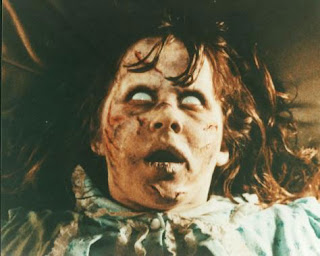
We researched the make up used to signify that a person has been possessed. Although for the trailer we want the girls to appear normal in order to contrast the unnatural things happening to them, we will use a shot that shows a girl to be completely possessed for the webpage and poster and for this we would like supernatural make up.


In 'The Exorcist', the possessed girl's face becomes pasty and covered in cuts and marks that appear like injuries. The girl has huge shadows under her eyes, which are completely white. We really like the idea of  changing the face to make it appear distorted and decaying so that it appears more shocking and unnatural. The injuries on the face suggest the power the spirit has and the fragility of the human, and we would like to incorporate this idea into the possessed make up. Making the eyes unnatural also appeals, as it really makes the image appear scary as the humanity is taken away from the victim to be replaced by something unnatural. The greasy hair of the victim also adds to the effect of making her appear no longer human. We would like to replicate this look, as it is haunting and stays with the audience even after the viewing of the film has finished. The unnatural nature of the look is especially effective because the character is a child, and we hope that this shock will also be created by a similarly unnatural look on a teenager. The contrast of decaying features with a normally youthful and healthy face acts to emphasise the disturbing nature of the spirit, and shows it to be a threat even to the life of the victim, as well as normality.


We were also interested in the markings on the skin that are used in 'The Haunting in Connecticut' [pictured right], and in two episodes of science fiction television programme 'Doctor Who', 'The Impossible Planet' and 'The Satan Pit' [pictured below right]. These are effective as they cover the whole body and reflect the nature of the spirit as they seem to communicate something about its past or what it wants. In 'The Haunting in Connecticut', the markings are carved into the skin, making it more shocking and                                          
upsetting to see and creating sympathy for the victim. In 'Doctor Who', the markings are instead unnaturally branded to the skin and only appear when the victim is possessed, being removed when the possessive entity is hiding. They are a different language, creating a sense of mystery as they cannot be read, but also emphasising the supernatural nature of the possession as the markings do not even seem to make sense and instead reflect a completely different species or culture. In 'Doctor Who', the face is also somewhat changed by red eyes and discoloured blue lips, making it appear even more unnatural. We find this idea interesting and would like to incorporate markings on the face of the possessed victim, as well as unnatural decay make up, in order to reflect the spirit's link with the world and hint at its past. We are going to use ouija board letters across the girl's face in order to reflect the manner in which the spirit was contacted and maintain the theme that the ouija board plays a large part in the events that follow. They also emphasise the gothic and supernatural nature of the film as they are in the same font used on ouija boards, which is decorative and old fashioned. We are also going to edit the victim's eyes to make them appear unnatural.


-Emily

House Mise En Scene

Through examining the 'Skins' trailer, we decided on the best mise en scene for the party scene. As most of our shots are mid shots and close ups, the mise en scene cannot be seen most of the time, but we used alcohol bottles and cans around the living room to suggest the amount that they had been drinking to show their levels of intoxication. The room will have low level lighting to reflect
the girls' disorientation and lack of awareness, and also accentuate the audience's confusion. The variety in alcohol containers also reflects their lack of sophistication and control over themselves, as they mix different kinds of alcohol. This adds to the idea of corruption and maintains the irresponsible perception of teenagers in today's society, which links to the audience's sense of justice that may occur when the girls are haunted and perhaps killed.


During the seance scene, the main feature of the mise en scene will be the ouija board in the centre of the room with the girls in a circle around it, although in some shots the alcohol containers can still be seen around them to keep the party atmosphere fresh in the audience's minds. The ouija board is dark and traditional in appearance, with symbols around the outside that emphasise the gothic nature of the item and hint at the ominous supernatural element. The board contrasts against the pale carpet, making it appear more noticeable and hinting at the dark magic being used, and starting to tip the equilibrium of the girls' lives into disequilibrium as the ouija board takes over their lives.


Throughout the rest of the shots as the hauntings begin occuring, the mise en scene of the rooms are not really seen due to low level lighting that creates intense shadows and makes the rooms appear more threatening. The walls and furnishings can sometimes be seen to the extent that they are clearly still normal, but the events taking place in front of them contrasts this and makes the audience feel discomfort as the expected safety is subverted.


-Emily


 Also see... House Location